May 2015 issue, Instore Jewelry Magazine [instoremag.com]
ACCORDING TO THE COLOR MARKETING GROUP (a professional organization for color designers), color can account for up to 85 percent of the reason people buy one product over another. And the effect is not limited to the item being considered for purchase. Colors that surround customers while they’re shopping also have an influence. The most successful brands leverage color’s poignant power to differentiate their businesses and to connect with customers. How can you use color to affect the jewelry shopping experience and turn browsers into buyers? Here are five ways:
1. Build brand recognition with color. According to studies, colors can boost brand recognition by 80 percent. Finding a way to work your logo colors into your interior design will help customers associate those colors with your store. A good example is the robin’s-egg blue used in Tiffany stores. But think beyond just the paint on your walls. The owners of The Diamond Center in Wisconsin, for example, wanted their new store to have a modern look like an Apple Store, so they adapted a color scheme that included white, slate, grays and silvers in the walls, fixtures and floors. Their suggested color scheme came from the Pantone Color Institute; you could research your own set of colors or seek a consultant’s help.

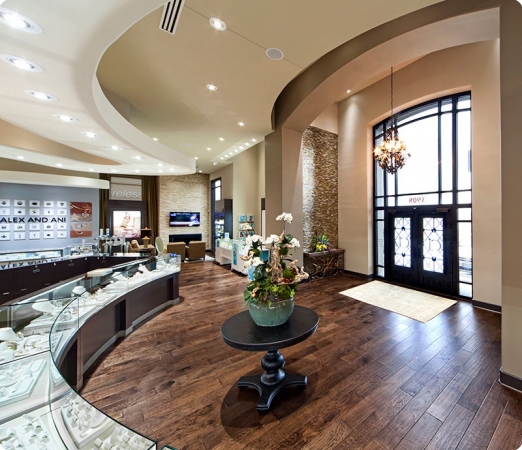
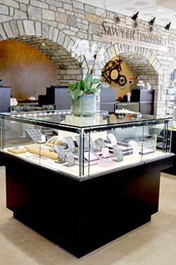
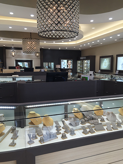
4. Don’t overpower your product — highlight it. In a jewelry store, the desired effect is that the merchandise should pop, not the surroundings. You don’t want to have explosive colors that are irritating to customers. Instead, choose neutral colors from a color family that fits your brand and the ambience you want to create and which will provide a background for your spectacular merchandise.

5. Use bright colors as accents. Under a scheme such as “Social Brights,” standout colors such as yellows, reds, oranges, bright blues and light purples make people happy and grab their attention. These colors should be used sparingly for accent walls or other small touches. These focal points can be changed out in a few years to add the next trendy color and make your shopping environment seem new to customers.

