February 2015 issue, Instore Jewelry Magazine
You have only 7 seconds to make your invitation!
They say you never get a second chance to make a first impression. This is especially important when it comes to jewelry store entries. Studies have indicated that a retailer has roughly seven seconds to capture the attention of passing potential customers. Developing powerful images right from the outset sends a strong message to people passing by or walking in. It also helps you to stand out from the competition and be remembered by customers.
The entrance to the store is the division between the outside and inside environments. As such, mall jewelry stores have an easier chance of luring customers into the store with a wide, open entrance, creating a seamless entry from the mall to the store. Jewelry retailers who depend largely on impulse traffic should try to create an open storefront, either by removing storefront barriers completely or by creating an unobstructed view into the store with glass frontage.
Street jewelers and some mall tenants who require portals due to climate control or a need for intimacy or security have less opportunity to give customers a tantalizing taste of the interior. For these retailers, an unobstructed and welcoming doorway combined with fantastic window displays can provide the lure. In all types of jewelry-store entrances, customers need to get the impression that they (and their children) will be comfortable and welcome. Obstacle courses, visual clutter and “Do Not” signs on the doors are turn-offs that often result in a negative first impression and a lost customer.
A visual hook is a call to action that diverts a customer’s attention to your store with a “Stop! There’s something here for you!” Powerful visual hooks are created by marrying other visual merchandising components for a more memorable first impression. A wonderful entrance presentation, an effectively signed promotional offering, a powerful interior display, in-store animation and lighting all serve as magnets to draw the customer in.
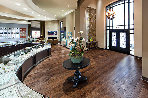
Lighting design can make a huge difference, but too often, jewelry retailers neglect it. A popular design element is to have a chandelier in the entry to set the stage for the style of the store’s interior. Another option is to use LED recessed cans. This will create a flood of light, keeping the entry bright without creating a focal point the minute you set foot in the store. It all depends on where you want the customer’s eyes to go, as well as how the entry lighting fits with the overall store design.
Many of today’s jewelry retailers are extending their store hooks into other senses beyond sight for a total image package. For example, the entry of the store could have beautiful music playing to enhance the customer’s mood.
As a rule, powerful images are the foundation of all jewelry retailing efforts. Within the first few seconds of catching their interest, the customer’s focus moves beyond the store’s exterior for a visual scan of the interior while they mull over whether to enter or not. Getting a customer through the door is indeed a victory. That’s why today’s jewelry stores must deliver wonderful first impressions in order for customers to feel comfortable and confident about buying from you.

